

I advise using the app/website as emails are often truncated due to images!
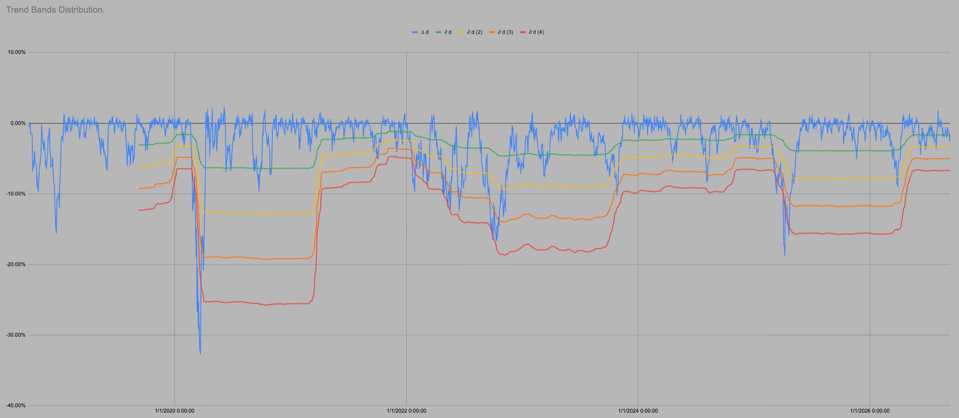
I post this chart every week. If you are new here it is probably a nonsense.
This is a chart of pressure. It uses price, volume, volatility and gamma to create regimes.
The longest of which are the 2 year volatility cycles. The others are smaller but self similar i.e. they look like the 2 year cycle but smaller.
It’s not rocket science nature came up with amazing things and reused them in tiny capillaries in a leaf all the way up to the largest tallest trees.
The price doesn’t matter it is where we are in these regimes.
Currently we are at the end of the 2 year cycle.
The bands are tight meaning 3% moves “feel” like 7-8% moves of a year ago.
The easy money has gone. Now there could be rises prices ahead but just as much right now is keeping as much as you can because in 3-6 months maybe you will be having a much harder decision of buying when the SPX is down 20-30% not 3%.
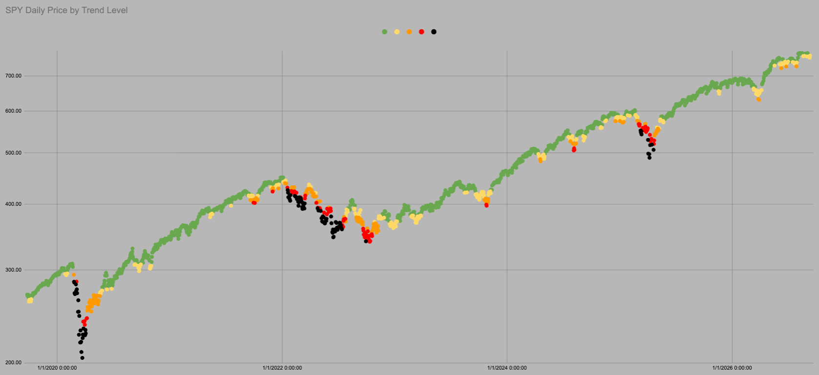
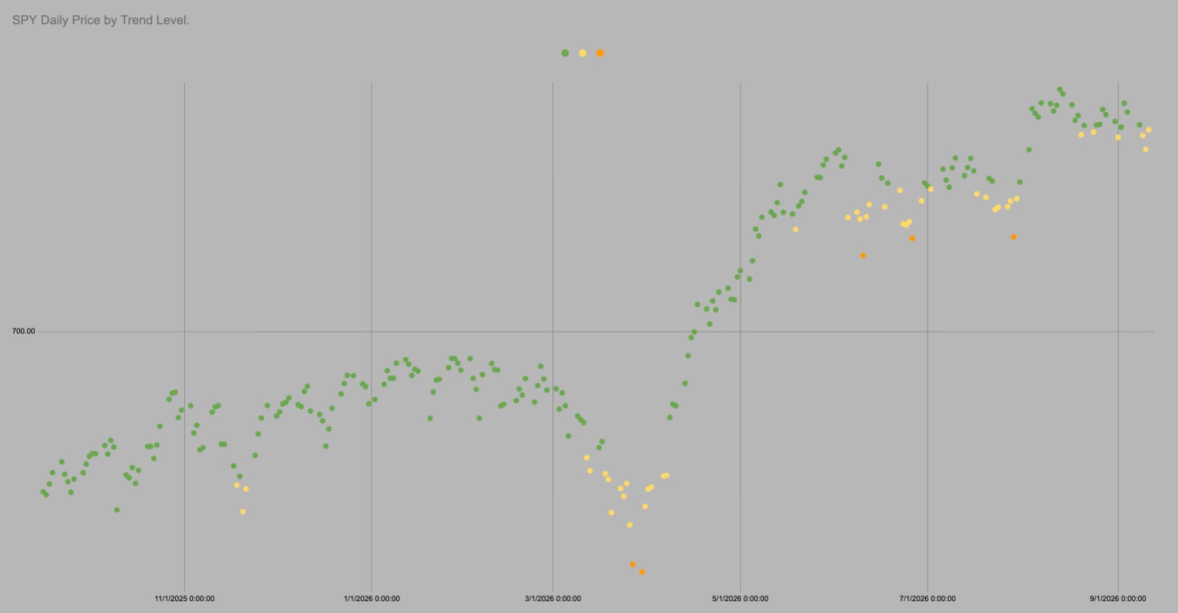
The dot is Green
Trend is 751.94
SPY spends 82% of all trading days above this level.
Its all cool beans.
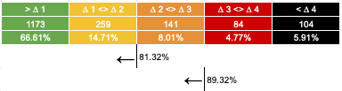
It is all the same chart so I can use all the same data. In the last 1761 trading days SPY has been above “trend” i.e. in green or yellow 82% of days.
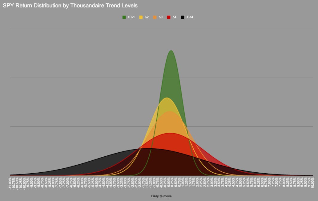
We could probably include orange as the distribution is very similar, but we need a transition point.
In 1761 trading days price has never moved directly from Green into Red/Black there is always an intermezzo hangout in Orange.
KeepItSimpleSubstack

Hot Takes with Hank

Think pieces!


