

I advise using the app/website as emails are often truncated due to images!
I love terrible charts, I think I am only able to make terrible charts because I hate 🐂💩
So many of the Fintwit chart porn examples the reason why they go viral is because they are simple. Why do we think a simple chart would explain the most complex human system on the planet?
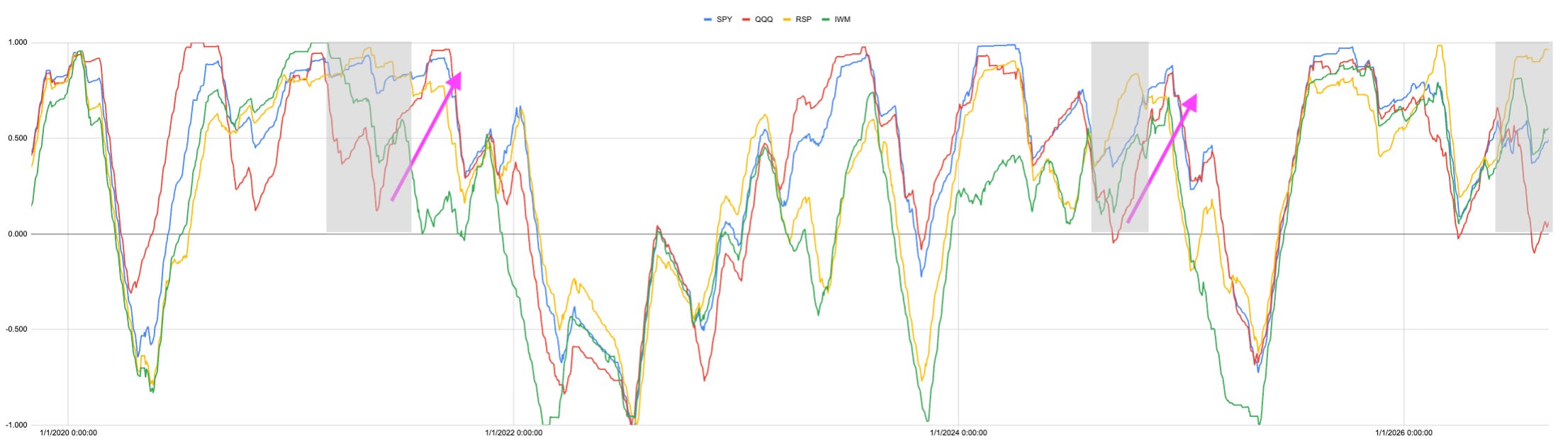
Anyway this is my 💩 chart this shows the Strength of Signal (SoS) measure that goes into my calculations. I have highlighted the points here where the different indexes diverge. I will go over it for paid subscribers, but the gist here is the seasonals support a rally.
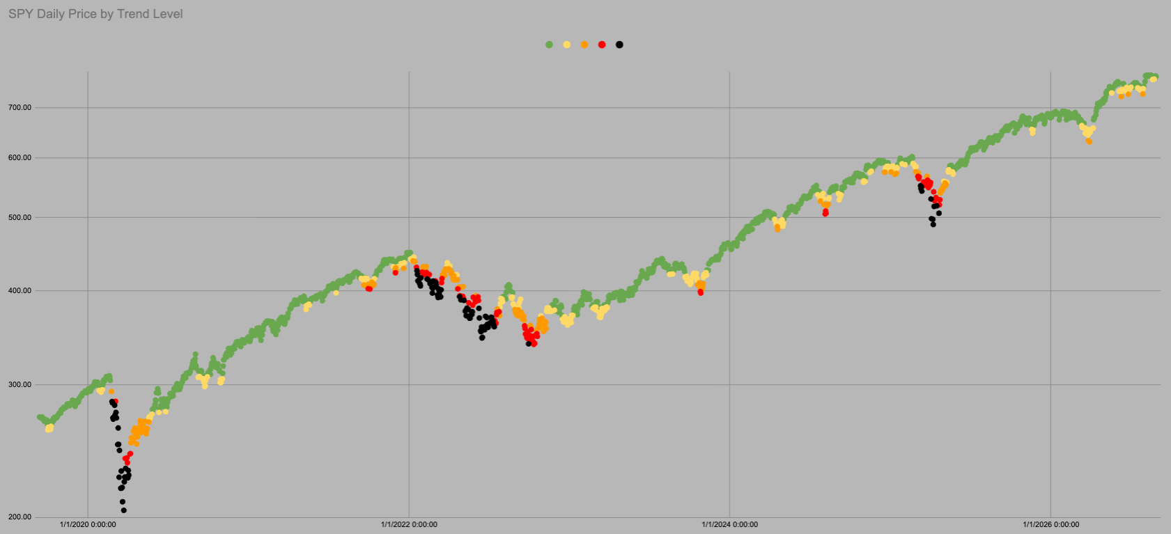
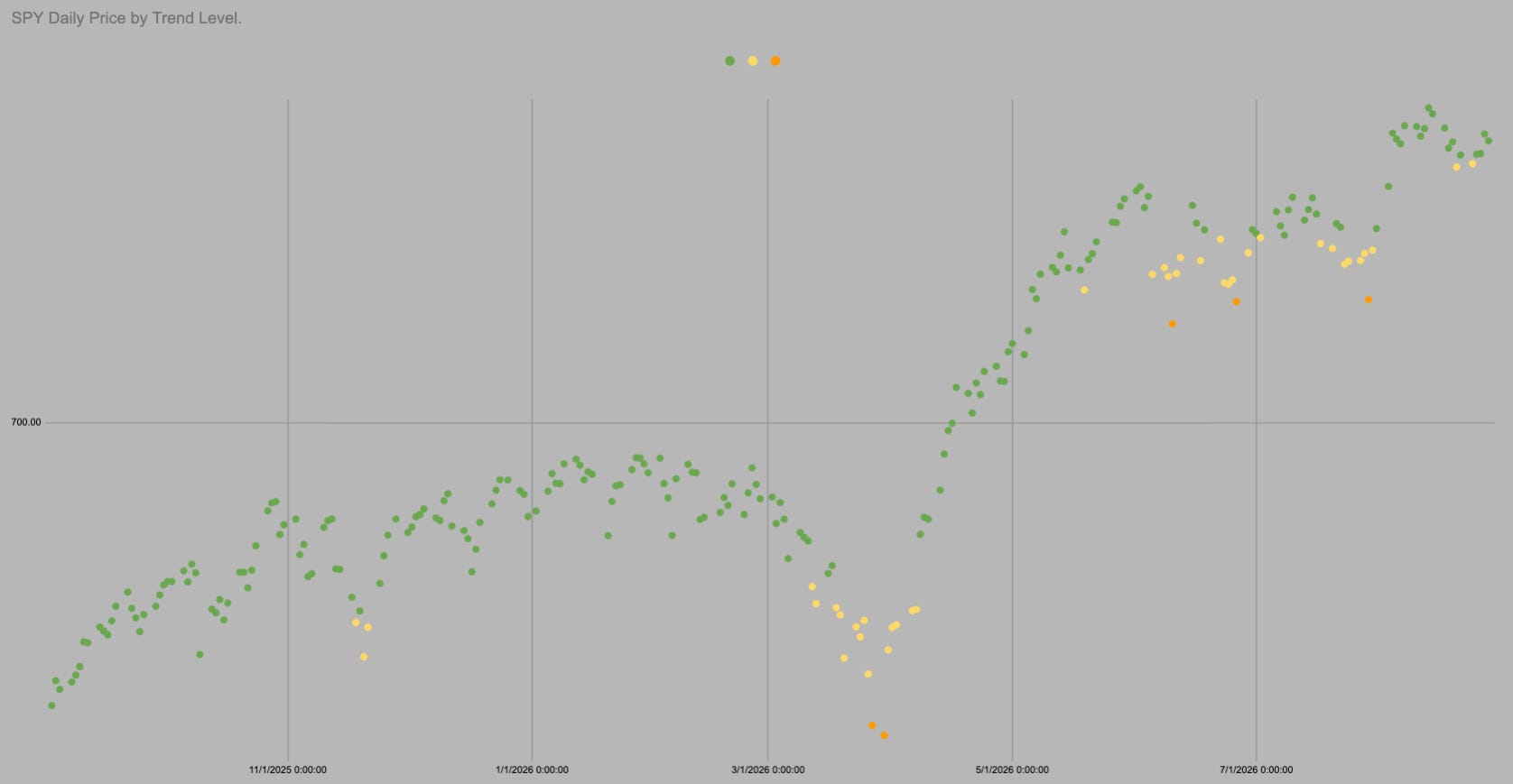
The dot is Green
Trend is 751.79
SPY spends 82% of all trading days above this level.
Its all cool beans.

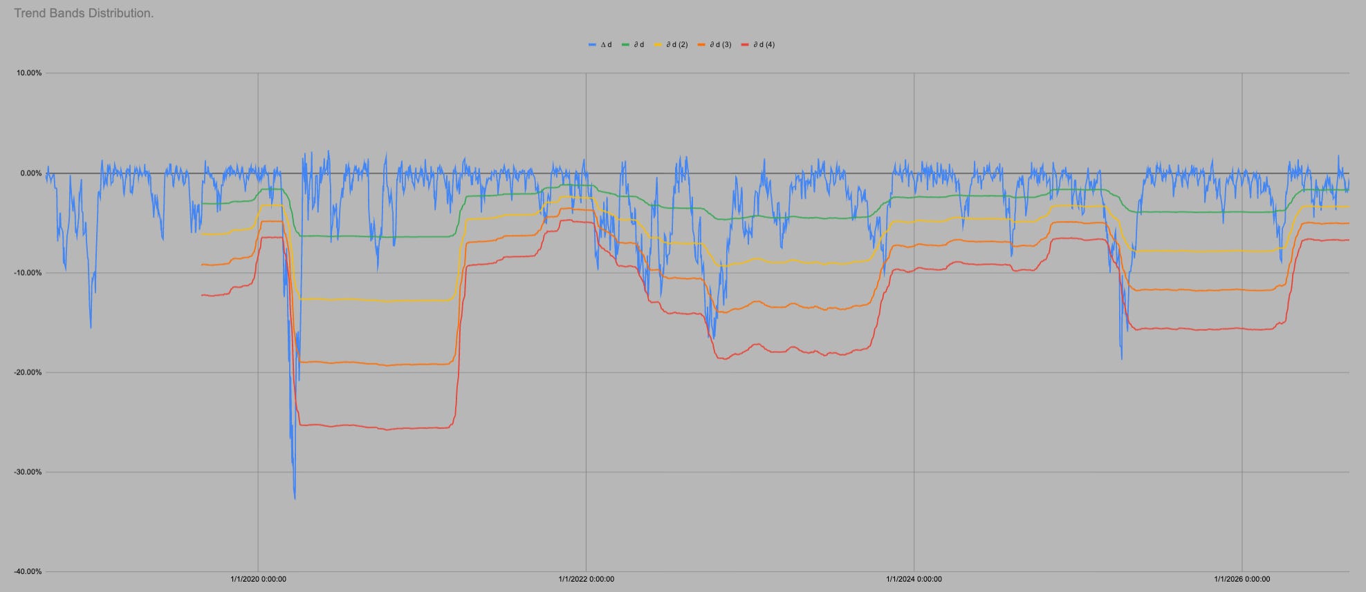
It is all the same chart so I can use all the same data. In the last 1761 trading days SPY has been above “trend” i.e. in green or yellow 82% of days.
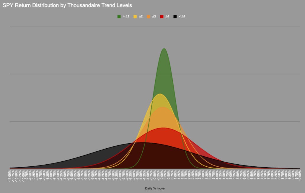
We could probably include orange as the distribution is very similar, but we need a transition point.
In 1761 trading days price has never moved directly from Green into Red/Black there is always an intermezzo hangout in Orange.
KeepItSimpleSubstack

Hot Takes with Hank
Think pieces!


