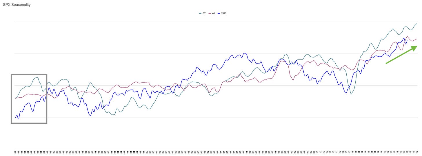
Which side of the chart?
Friday 21st December - Daily Equity Update
When you look at a time series price chart, where do you look first?
It is almost always on the right-hand side. This makes sense because that is the most recent data.
If you are looking at any of the many “seasonality” charts they are almost always looking at the green arrow. What about the grey box?
Caution. 2018.
Increase to Full : GD ANET IBM

Reduce to Half : HIG


