Bored of windows yet?
Week 7 - Weekly equity Update
Concepts are like bubbles. Four years ago as a non-option user, I learned everything I could about them. I am very far from an expert I probably know just enough to be dangerous. I went down the Gamma Exposure rabbit hole as part of the journey. I thought I was playing catch-up but soon realised I was way ahead of the layperson curve. On the bubble curve, it is buying a stock at 50 and selling at 500 because it is now “overvalued” but it was a little stop on its way to 5000.
I feel this way now about the so-called croissant crumbs.
The windows of weakness as they are known. Just because I have been following along for a year trying to piece together the crumbs and stitching it together with my work are we at 50, 500 or 5000?
Is this widely known? Can it be gamed? Is it an edge?
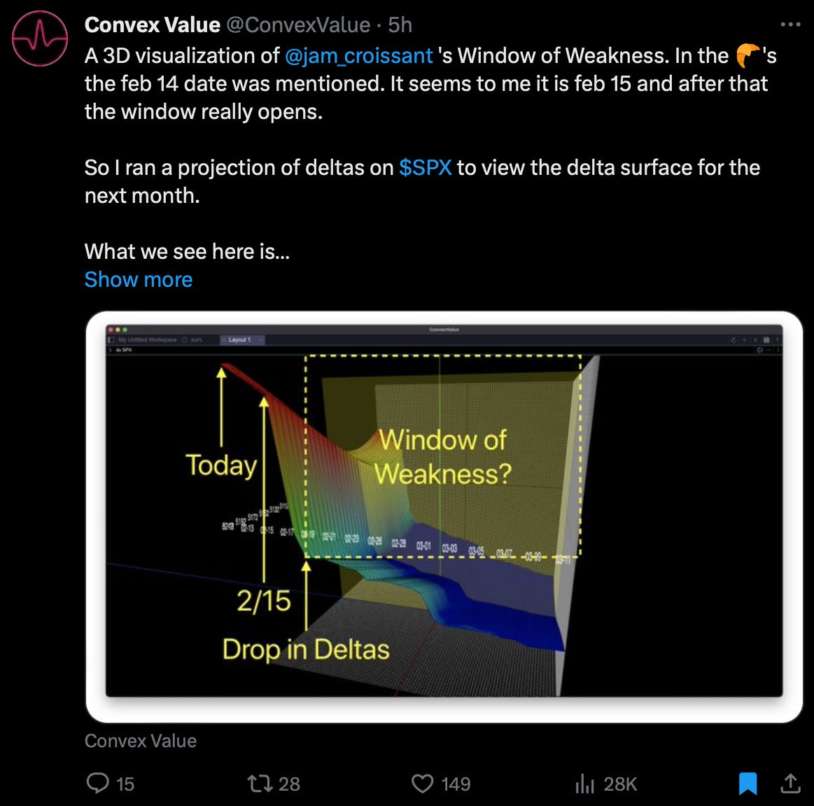
The very fancy 3D surface chart above…
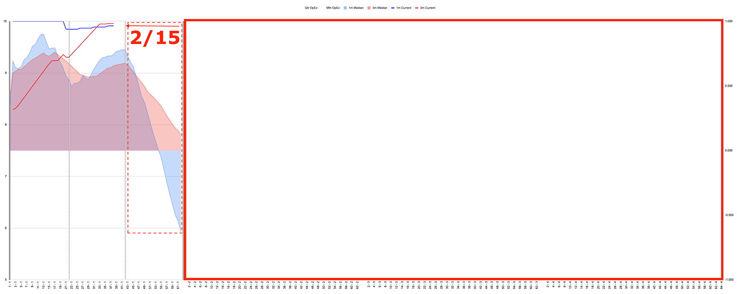
Based on my work a very janky 2D spreadsheet. Mr C Value uses options prices, I don’t. Yet we end up with a very similar picture.
As I said last week this alone is not a signal it is simply a possible path across the terrain.
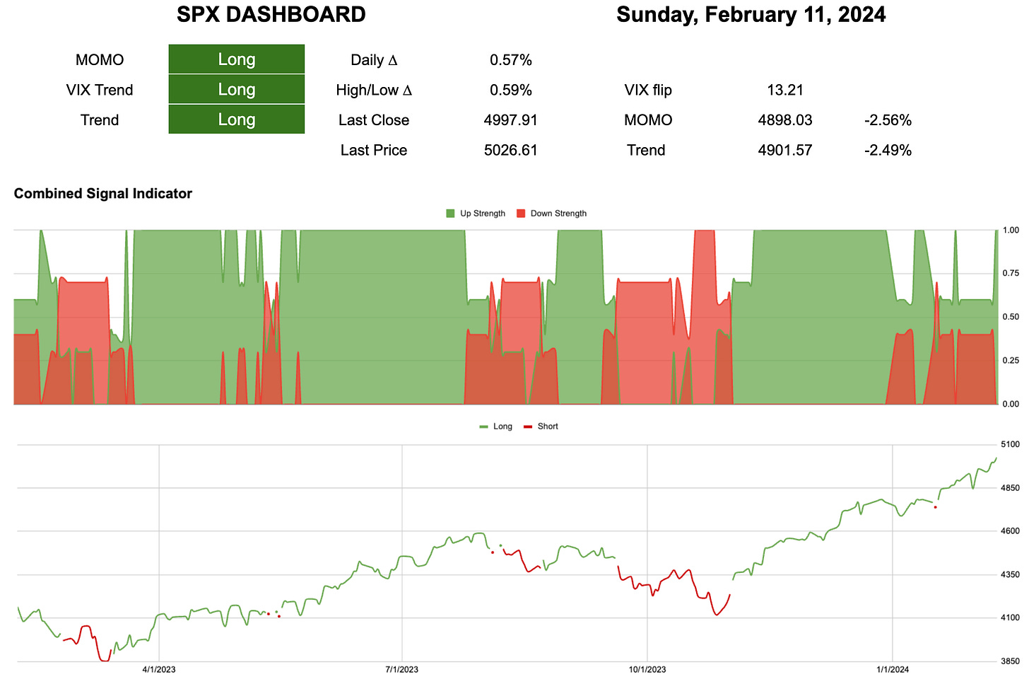
With the drop in Vol, we went to max long last week on the combined signal.
2.5% ~4900 is the decision point on risk management.
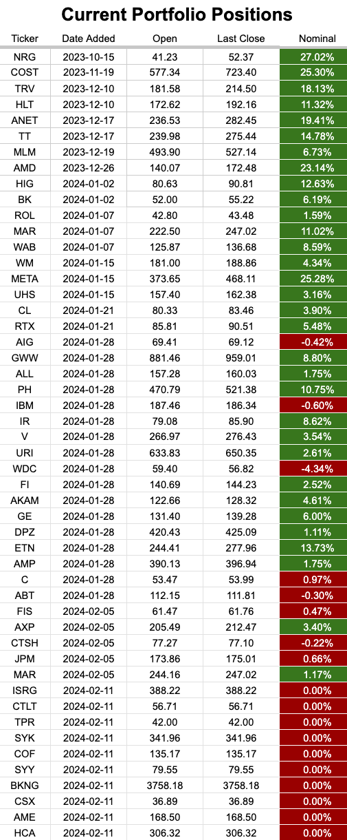
Large over-weights to Financials and Industrials. A close match to Health Care now this week and Technology. All other sectors are under-weight.
Just when you start to get confident with the plan moving forward…
‘Detrick enters the timeline!!”


