Big wiggle, little wiggle...
Wednesday 6th march - Daily Equity Update
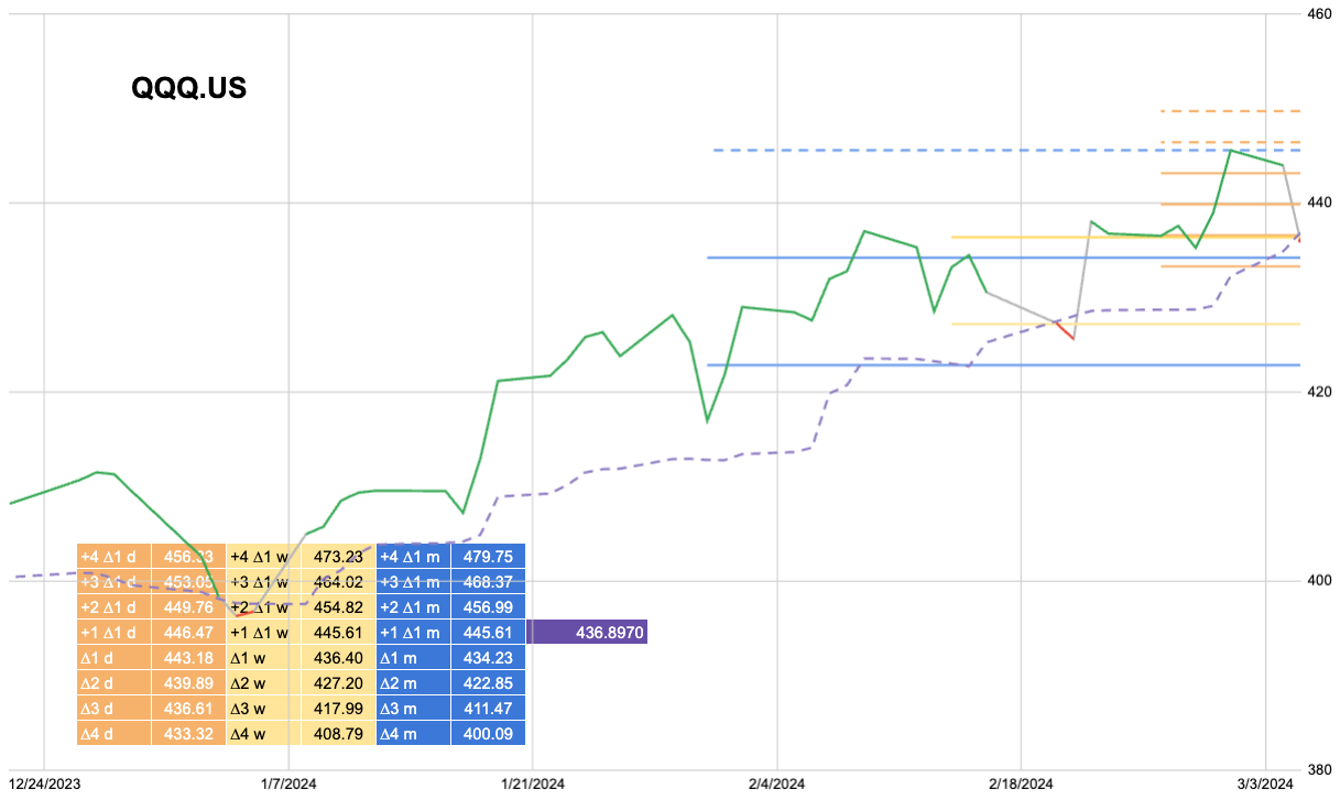
I was asked yesterday about intra-day moves. Like any good finance nerd, I have developed my own “levels”.
These use measures very similar to those that pick the portfolio just using lower timeframes and a tighter lookback.
This is the SPX using 1 hour input. What I like about these measures is the striping out of price. A ∆3 move today might be 5200 last week it was 4850 made-up numbers but you get my point.
This means we can define moves less by price and more by a constant measure. These measures are very similar to Standard Deviation but I do something different to the price data first.
Then you can change the scale to measure all kinds of things.
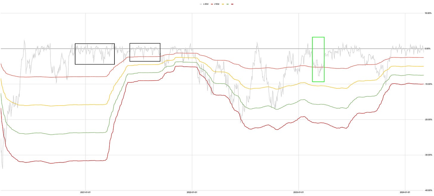
This chart shows the end of 2022 using daily data on a 3-month lookback.
The low in November 2022 was a nominal low on the price chart. Using my measure the picture was very different. The end of days crisis that would have spawned a million YouTube videos with thumbnails of fire and brimstone was invalidated by August. Mathematically to break the then compressing volatility distribution would have taken a 40-50% drop, the so-called second leg down. By November that outcome was also invalidated. We have compressed Vol even further since then.
Once we move through March the wiggly lines in the green box disappear and the bands will compress again.
Are we in a time similar to the first black box where the lines are about to compress? Or in the second box?
The outcome of these measures barring any exogenous shock, which we could always have, is as they compress they are easier to break.
Now this chart uses annual vol and a 60-day lookback. This is not a 0DTE wiggly line tick data chart.
Multiple measures multiple timeframes.
Before we make a blip on that chart, we have to break MOMO and Trend and we aren’t there yet.
I do produce daily levels.
If people are interested I can share them but that would be the kind of thing that would need to go behind a paywall. Let me know.
Reduce   : Half URI
         : Cash V

Increase : COF


