Axis speak louder than words.
Friday 5th June - Daily Equity Update
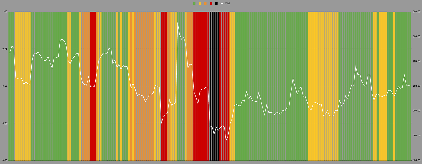
I had to move the axis again, and the lines are green.
April as small as it was, was a big move. Anyone who has listened to me for a while will know this is important.
As we move through time all of the different measures and levels come together. This black line in April was -4%. To get this same level in Oct ‘23 took -10%.
Let me know if this image link worked.
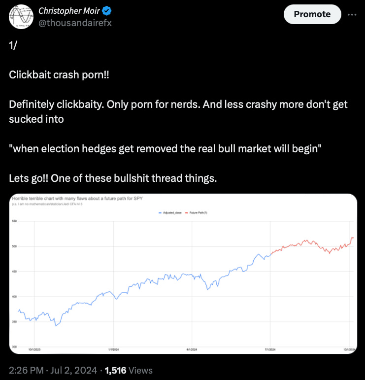
This was the point I made with this thread.
I never understand why people have to take the hero trade. Why not shoot the lame duck?
Perhaps not now though. I am updating these charts to have a better description of the timeframes. Like anything useful its not that simple.
Let’s just say this is an hourly chart.
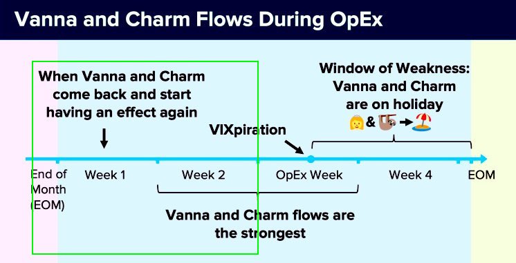
Emojis are back onside.


